
In CSS3, we can add shadows to objects without using images. We do need to add prefixes for Mozilla and Webkit browsers, so in effect adding the same styles 3 times (unless we use Prefix free).
We have quite a lot of options with how we create the shadows; they can be outset, inset (or both), and have multiple colours – all of which I’ll explore below.
Outer shadow
Here is how an outer shadow applied to an image tag appears via the medium of this yummy looking cupcake:

View demo
The markup:
img {
	-webkit-box-shadow: 0px 0px 5px 3px #999;
    	-moz-box-shadow: 0px 0px 5px 3px #999;
    	box-shadow: 0px 0px 5px 3px #999;
}
This markup produces an outer shadow, with the shadow extending the same amount from every side of the element it is assigned to (in this case, an image). The meanings of the four numbers are as follows:
- Horizontal offset
- Vertical offset
- Blur distance
- Spread distance
Outer shadow (offset)
In the previous example, we didn’t add any values to make the shadow appear offset. Let’s see what happens when we do:

View demo
Markup:
img {
	-webkit-box-shadow: 4px 4px 5px 3px #999;
    	-moz-box-shadow: 4px 4px 5px 3px #999;
    	box-shadow: 4px 4px 5px 3px #999;
}
Inner shadow
We can also make shadows appear to be inside of an element. I shall use a div as an example this time, as we may not be able to see the inside shadow with an image in the way:

View demo
Markup:
div {
	-webkit-box-shadow: inset 0 0 5px 3px #999;
    	-moz-box-shadow: inset 0 0 5px 3px #999;
    	box-shadow: inset 0 0 5px 3px #999;
}
Inner and outer shadows on the same element
Multiple shadows can be applied to an element. Here is an example of when both inner and outer shadows are applied to a div. Each shadow is a slightly different colour (outer shadow is darker grey, inner shadow is lighter grey), so we can see them easier:

View demo
Markup:
div {
    	-webkit-box-shadow: inset 2px 2px 4px 1px #ccc, 2px 2px 4px 1px #999;
    	-moz-box-shadow: inset 2px 2px 4px 1px #ccc, 2px 2px 4px 1px #999;
    	box-shadow: inset 2px 2px 4px 1px #ccc, 2px 2px 4px 1px #999;
}
Double shadows of the same type
We can’t just put two different types of shadows onto an object, we can also apply two shadows of the same type; for example, two inner shadows:

View demo
Markup:
div {
    	-webkit-box-shadow: inset 2px 2px 4px 1px #ccc, inset -2px -2px 4px 1px #999;
    	-moz-box-shadow: inset 2px 2px 4px 1px #ccc, inset -2px -2px 4px 1px #999;
    	box-shadow: inset 2px 2px 4px 1px #ccc, inset -2px -2px 4px 1px #999;
}
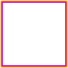
Multiple coloured shadows
Shadows don’t even have to be only one colour. Here is an example of an outer shadow with no offset, with the shadow blending from purple to pink to orange:
View demo
Markup:
div {
    	-webkit-box-shadow: 0 0 4px 2px #90f, 0 0 4px 4px #f06, 0 0 4px 7px #f90;
    	-moz-box-shadow: 0 0 4px 2px #90f, 0 0 4px 4px #f06, 0 0 4px 7px #f90;
    	box-shadow: 0 0 4px 2px #90f, 0 0 4px 4px #f06, 0 0 4px 7px #f90;
}
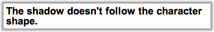
What happens if I apply box-shadow to text?
This will happen – the shadow will follow the box shape of the text element (it won’t go around the characters):
View demo
If this is what you want, fine, but if you want the shadow to follow the shapes of the characters, use text-shadow instead.