
CSS3 is exciting (well at least I think so :)), as it allows animations to be carried out on HTML elements to move them, change their colour and size, etc. In this post, I’ll be looking at the basics of how CSS3 transitions work, with a few examples along the way.
Transition effects can be applied to any HTML element; for example, a div, span, p tag, a tag – anything you like.
Please note: I have not included vendor prefixes within my markup examples, as it would just take up too much needless space, so if you’re not using PrefixFree like I am, you’ll need to add these in yourself for the different browsers.
Syntax
Properties overview
Transition properties are applied to the object that is to be animated; specifying which property of an element to be animated (e.g. background colour, border width), the duration of the animation and the time delay before it starts running. Let’s see briefly what these properties do, and I’ll add some examples of each a bit further on…
- transition-property: Any CSS property can be specified here to allow the animation to affect just that property (e.g. background, color, padding, etc.), or the transformations can be applied to all properties within the element;
- transition-duration: Duration is the amount of time the animation takes to complete from start to finish, and it is written in seconds. Duration of an animation must be set, or the animation will not run;
- transition-timing-function: Otherwise known as easing. Easing controls the speed of the animation at certain points. It isn’t absolutely necessary to add the easing function if not required, and the animation will still run. If no easing controls are added, it defaults to ease-in-out;
- transition-delay: A delay measured in seconds can be added at the beginning of the animation. If not added, there will be no delay as default.
The markup
In my examples, the demos will be applied to an empty div element.
CSS portion
div {
	transition-property: value;
	transition-duration: value;
	transition-timing-function: value;
	transition-delay: value;
}
HTML portion
<div></div>
Shorthand CSS markup
Instead of adding in all the properties separately, they can be shortened into one line as follows. The order doesn’t matter, but the duration of the animation is the first number in seconds, and the delay is the second:
div {
	transition: property duration timing-function delay;
}
Transition property examples
Here I’ll be going through the transition properties mentioned above, explaining which values can be used for each and giving examples. For all the examples I create in this post, I’ll use a div styled to be a 200×200 pixel square with a blue background, and the transition will happen on the hover state (when the mouse is passed over the element) for simplicity’s sake.
transition-property
This is used to specify what CSS property/properties that are to be transitioned.
Changing a singular property
In this example, I’m only changing the background property of the div from blue to orange with the animation initiating on the hover state. No other properties will be affected.

View demo
The markup
In the styles for the div, I specify which background colour I would like it to start out with (blue/#0cf), as well as specifying the value of background-color for transition-property. Then under the styles for the hover state of the div, I specify the colour which I’d like it to change to at the end of the animation (orange/#fc0). When the animation runs, the div should fade from blue to orange. I also had to add a duration or the animation would not run (it would just flick immediately to the animated state), so I specified it to be two seconds.
CSS portion
div {
	background-color: #0cf;
	transition-property: background-color;
	transition-duration: 2s;
}

div:hover {
	background-color: #fc0;
}
HTML portion
<div></div>
Changing multiple properties
In this example, multiple single properties are being animated together. The colour change from blue to orange occurs as in the previous example, as well as an increase in padding on the right side of the div from 0 to 100px, which makes it look like it is expanding to the right.

View demo
The markup
Multiple single properties can be affected by listing them one after another and separating them by commas.
CSS portion
div {
	background-color: #0cf;
	padding: 0;
	transition-property: background-color, padding-right;
	transition-duration: 2s;
}

div:hover {
	background-color: #fc0;
	padding-right: 100px;
}
HTML portion
<div></div>
Changing all properties
In this example, all properties of the element are changed, so there is no need to specify separate elements. As in the example above, colour and padding CSS classes of the div are changed throughout the course of the animation, as well as the colour of the border, which changes from black to red.

View demo
The markup
The value of all is added to transition-property to animate all properties.
CSS portion
div {
	background-color: #0cf;
	padding: 0;
	border: 5px solid #000;
	transition-property: all;
	transition-duration: 2s;
}

div:hover {
	background-color: #fc0;
	padding-right: 100px;
	border: 5px solid #f00;
}
HTML portion
<div></div>
transition-duration
Duration is the amount of time the transition takes to complete from start to finish; it is written in seconds. Duration of a transition must be set or it will not run; it will just immediately flick from one state to the next. I need to use this for all animations, so I don’t think it needs a specific visual example, so for this I will show the markup only:
The markup
Duration is very simple, the number of seconds just needs to be specified as the value. Obviously the higher the value, the longer the transition will run for.
CSS portion
div {
	transition-duration: 2s;
}
transition-timing-function
This controls the easing of the transition. Easing controls the speed of the transition at certain points. It isn’t absolutely necessary to add the easing function if not required, and the transition will still run with the default value of ease-in-out. There are several possible values for this property, which are covered here – I have shown how the speed is controlled by increasing the padding to the right of the div as the transition progresses so it looks like it is expanding out to the right:
linear
The transition runs at a steady pace.

View demo
The markup
CSS portion
div {
	padding-right: 0;
	transition-property: padding-right;
	transition-duration: 3s;
	transition-timing-function: linear;
}

div:hover {
	padding-right: 400px;
}
HTML portion
<div></div>
ease-in
The transition starts off slow and speeds up towards the end.

View demo
The markup
CSS portion
div {
	padding-right: 0;
	transition-property: padding-right;
	transition-duration: 3s;
	transition-timing-function: ease-in;
}

div:hover {
	padding-right: 400px;
}
HTML portion
<div></div>
ease-out
The transition starts off at a fast pace and slows down towards the end.

View demo
The markup
CSS portion
div {
	padding-right: 0;
	transition-property: padding-right;
	transition-duration: 3s;
	transition-timing-function: ease-out;
}

div:hover {
	padding-right: 400px;
}
HTML portion
<div></div>
ease-in-out
The transition starts off slow, speeds up in the middle and slows down again towards the end.

View demo
The markup
CSS portion
div {
	padding-right: 0;
	transition-property: padding-right;
	transition-duration: 3s;
	transition-timing-function: ease-in-out;
}

div:hover {
	padding-right: 400px;
}
HTML portion
<div></div>
cubic-bezier
You can specify exactly how fast you want your transition to run throughout by using the idea of the bezier curve. I personally get confused about this, but I found this CSS cubic-bezier builder which may be of some use! My example starts off fast, slows down completely, and then starts to pick up speed again towards the end.

View demo
The markup
The value cubic-bezier is used for transition-timing-function, and four numbers are placed in brackets which relate to the bezier curve determining the speed of the transition.
CSS portion
div {
	padding-right: 0;
	transition-property: padding-right;
	transition-duration: 3s;
	transition-timing-function: cubic-bezier(.03,.84,.35,.21);
}

div:hover {
	padding-right: 400px;
}
HTML portion
<div></div>
transition-delay
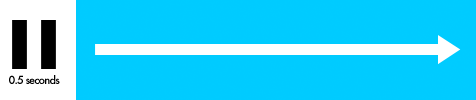
A delay can be added at the beginning of the transition; it is measured in seconds. If not added, there will be no delay to the transition as default.
View demo
The markup
In this example, I have added the value .5s to the transition-delay property so that before the transition starts, there will be a half second wait.
CSS portion
div {
	padding-right: 0;
	transition-property: padding-right;
	transition-duration: 2s;
	transition-delay: .5s;
}

div:hover {
	padding-right: 400px;
}
HTML portion
<div></div>