
Believe it or not, triangle shapes can be drawn with pure CSS, no images needed. In this post I’ll be explaining how different types of triangles can be drawn with a clever little trick involving borders on an element.
How it is done
A triangle is created in CSS by using borders on an HTML element in a particular way. Here’s how:
- Use a block-level element; in my case I’m using a
<p>tag. - Set the width and height of the element to 0 via CSS.
- Apply borders to certain sides of the shape. The way this works, is as the element has no width or height, it won’t show up at all. So if I now add a border, this is the only thing that will be visible around the (non-existent) object, and as the shape has no width or height, the borders will converge on the starting point, creating 45 degree angles at the corners. This diagram should explain what I mean; it shows what my
<p>tag would look like if it has an 80 pixel wide different coloured border on each side (top, bottom, left and right) – it looks like there are four triangles all pointing inwards towards each other: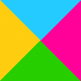
View demo
- The width of the borders determines the height of the triangles.
- Building on this knowledge, I can create just a singular triangle. Let’s say I want to create an upwards-pointing triangle like the green one in the example above; what I need to do is get rid of the other borders, leaving the bottom border. I can remove the top border from the CSS with no problems as it doesn’t touch the bottom one, and won’t interfere in any way. But, if I remove the left and right borders, all the borders will just disappear, as the element will no longer have any width provided by those borders and will therefore render the element layout-less. So what I need to do is keep them in the CSS, but change their colour to transparent – that way they are still there, just not visible, and so the layout aspect of the element is still retained along with the 45° angles at the corners of the invisible borders and the visible one, leaving the triangle I wanted to keep:

View demo
- Read on for example markup for various types of triangles…
Types of triangles
Names are given to triangles to describe how many equal sides they have and the sizes of angles they contain. I’m going to explain below how to make different types of triangles with HTML/CSS and provide the markup for each one.
Isosceles triangles
An isosceles triangle has two equal sides and two equal angles. In the explanation of how to create a triangle above, I ended up with an isosceles triangle. Here I will go through and provide CSS markup for isosceles triangles pointing in different directions and of different widths and heights:
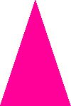
Upwards pointing isosceles triangle

View demo
Markup
This is the same triangle I created for the explanation. The left and right borders should be transparent and the bottom border, which is the one that will form the triangle shape, should be coloured. A top border is not needed, and so can be left out.
HTML portion
<p>I am an upwards pointing triangle.</p>
CSS portion
p {
	width: 0;
	height: 0;
	text-indent: -9999px;
	border-right: 80px solid transparent;
	border-bottom: 80px solid #f09;
	border-left: 80px solid transparent;
}
Downwards pointing isosceles triangle

View demo
Markup
To create a downward pointing arrow, the left and right borders should be transparent and the top border should be coloured. A bottom border is not needed, and so can be left out.
HTML portion
<p>I am a downwards pointing triangle.</p>
CSS portion
p {
	width: 0;
	height: 0;
	text-indent: -9999px;
	border-top: 80px solid #f09;
	border-right: 80px solid transparent;
	border-left: 80px solid transparent;
}
Left pointing isosceles triangle

View demo
Markup
To create an arrow pointing to the left, the top and bottom borders should be transparent and the right border should be coloured. A left border is not needed, and so can be left out.
HTML portion
<p>I am a left pointing triangle.</p>
CSS portion
p {
	width: 0;
	height: 0;
	text-indent: -9999px;
	border-top: 80px solid transparent;
	border-right: 80px solid #f09;
	border-bottom: 80px solid transparent;
}
Right pointing isosceles triangle

View demo
Markup
To create an arrow pointing to the right, the top and bottom borders should be transparent and the left border should be coloured. A right border is not needed, and so can be left out.
HTML portion
<p>I am a right pointing triangle.</p>
CSS portion
p {
	width: 0;
	height: 0;
	text-indent: -9999px;
	border-top: 80px solid transparent;
	border-bottom: 80px solid transparent;
	border-left: 80px solid #f09;
}
Narrow isosceles triangle
View demo
Markup
To create a narrower triangle, I need to reduce the size of the left and right transparent borders. I’ve also increased the size of the bottom border in this example to make the triangle taller.
HTML portion
<p>I am a narrow triangle.</p>
CSS portion
p {
	width: 0;
	height: 0;
	text-indent: -9999px;
	border-right: 50px solid transparent;
	border-bottom: 150px solid #f09;
	border-left: 50px solid transparent;
}
Wide isosceles triangle

View demo
Markup
To create a wider triangle, I need to increase the size of the left and right transparent borders. I’ve also reduced the size of the bottom border in this example to make the triangle shorter.
HTML portion
<p>I am a wide triangle.</p>
CSS portion
p {
	width: 0;
	height: 0;
	text-indent: -9999px;
	border-right: 120px solid transparent;
	border-bottom: 80px solid #f09;
	border-left: 120px solid transparent;
}
Equilateral triangle
An equilateral triangle has three equal sides and three equal angles, all of which are 60°.

View demo
Markup
To create an equilateral triangle, I just have to get the triangle to look like it has 3 equal sides and 3 equal angles – I’m doing this by eye, but I’m sure there’s a more mathematical approach! In my example, I have just used the upwards pointing isosceles triangle example, but increased the bottom border size a bit to even out the dimensions.
HTML portion
<p>I am an equilateral triangle.</p>
CSS portion
p {
	width: 0;
	height: 0;
	text-indent: -9999px;
	border-right: 80px solid transparent;
	border-bottom: 130px solid #f09;
	border-left: 80px solid transparent;
}
Scalene triangle
A scalene triangle doesn’t have any equal sides or equal angles.

View demo
Markup
To create a scalene triangle, each border needs to be a different size. With this example, I took the upwards pointing isosceles triangle, increased the size of the bottom border a little to increase the height of the triangle, reduced the right border and increased the left border size to produce this result.
HTML portion
<p>I am a scalene triangle.</p>
CSS portion
p {
	width: 0;
	height: 0;
	text-indent: -9999px;
	border-right: 40px solid transparent;
	border-bottom: 100px solid #f09;
	border-left: 150px solid transparent;
}
Right angle triangle
With a right angle triangle, one of the three angles is 90°.

View demo
Markup
To create a right angle triangle, one of the borders need to be removed to create the sharp edge. In my example, I have removed the right hand border, the left is kept as transparent and given a width, and the bottom is coloured.
HTML portion
<p>I am a right angle triangle.</p>
CSS portion
p {
	width: 0;
	height: 0;
	text-indent: -9999px;
	border-bottom: 100px solid #f09;
	border-left: 150px solid transparent;
}
Obtuse angle triangle
An obtuse triangle has an angle of more than 90°, so one of the angles will make the triangle look like it’s bending backwards.

View demo
Markup
To create an obtuse angle triangle, I will actually have to create 2 right angled triangles and place them on top of one another to create the illusion; the first to be created is the coloured triangle, which will need to be positioned relatively. The second triangle needs to be the colour of the background of the web page it is to go onto (in my case, white). It needs to be applied to :before or :after the element (which in my example is a <p> tag), or to an additional container element like a <div> or <span>.
This second triangle needs to be positioned absolutely so it will sit over the top of the coloured triangle, and therefore obscure a part of it. In my example, the right angle of the coloured triangle sits to the right of the shape, to I have positioned the second triangle to the right to block off that right angle with its own sloping angle.
HTML portion
<p>I am an obtuse angle triangle.</p>
CSS portion
p {
	width: 0;
	height: 0;
	position: relative;
	text-indent: -9999px;
	border-bottom: 100px solid #f09;
	border-left: 150px solid transparent;
}

p:after {
	width: 0;
	height: 0;
	position: absolute;
	right: 0;
	content: "";
	border-bottom: 100px solid #fff;
	border-left: 30px solid transparent;
}
Acute angle triangle
With an acute triangle, all angles are less than 90°. See my scalene triangle example above for an example of an acute triangle.
Go forth and experiment
So armed with this knowledge, you never know when a CSS triangle may come in useful. A popular use is for speech bubbles, so images aren’t needed and the colour/style of the whole thing can be changed via CSS instead of messing around with images in an editor. See my Twitter feed in the right hand sidebar for an example which uses an obtuse angle triangle.
Hi can you give me all triangle complete example