
In this post, I’m going to look at linear and radial gradients and the methods required to apply them as a fill to various different shapes within a Canvas. Gradients are very versatile; they can include multiple colour stops and be positioned within a shape.
Linear gradients
A linear gradient is where a colour is gradually faded into another colour along a straight path.
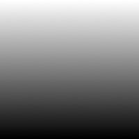
Two colour black to white linear gradient
The easiest way to see how a linear gradient works on a Canvas is to just use two colours to start with. Here I’m going to be creating a linear gradient which goes from black to white, filling a simple rectangle shape.
View demo
The markup
First I create the gradient before I instruct a shape to be filled with it. To create the gradient, a variable is created called linearGradient, which calls the context createLinearGradient together with a string of parameters, which mean as follows:
- Gradient start X position
- Gradient start Y position
- Gradient end X position
- Gradient end Y position
In my example, the gradient start X value is set to the width of the Canvas (200px) so the gradient spans it horizontally, and the start Y position is set to 0 to it begins at the top. The end values are then set to 200 (X) and 200 (Y), so the gradient runs straight down and fills the Canvas vertically by 200px.
Next, I add the colour stops. As I want to create a two-colour gradient, I add two colour stops; one for black and one for white. The number before the colour declaration indicates where that colour starts in the shape it is applied to; the minimum value is 0 and the maximum value is 1. In my example, white starts at the min 0 value (the top of the Canvas), and black is at the max 1 value (the bottom of the Canvas), and all space between is where the two colours blend together. Colour stops can occur at any values in between 0 and 1, for example, 0.25, 0.5, etc.
Lastly, we set the fillStyle context to the variable linearGradient we created before and then draw our shape (in my case, a rectangle) which will be filled with the gradient we just created.
Javascript portion
function draw() {
	// Linear gradient 2 colours
	var canvas = document.getElementById("gradientLinearTwoColours");
	if (canvas.getContext){
        	var ctx = canvas.getContext("2d");

		var linearGradient = ctx.createLinearGradient(200, 0, 200, 200);
		linearGradient.addColorStop(0, "#fff");
		linearGradient.addColorStop(1, "#000");

		ctx.fillStyle = linearGradient;

		ctx.fillRect (0, 0, 200, 200);
	}
}
HTML portion
<body onLoad="draw();">
	<canvas id="gradientLinearTwoColours" width="200" height="200"></canvas>
</body>
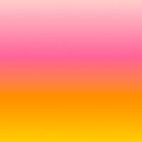
Four colour linear gradient
Linear gradients can be created with more colours by simply adding more colour stops. I’m going to add some prettier colours to this next example to make it slightly more interesting, as well.
View demo
The markup
As mentioned before, I just add more colour stops. In my example I have added colour stops in various shades of pink and orange.
Javascript portion
function draw() {
	// Linear gradient 4 colours
	var canvas = document.getElementById("gradientLinearFourColours");
	if (canvas.getContext){
        	var ctx = canvas.getContext("2d");

		linearGradient = ctx.createLinearGradient(200, 0, 200, 200);
		linearGradient.addColorStop(0, "#fcc");
		linearGradient.addColorStop(0.4, "#f69");
		linearGradient.addColorStop(0.75, "#f90");
		linearGradient.addColorStop(1, "#fc3");

		ctx.fillStyle = linearGradient;

		ctx.fillRect (0, 0, 200, 200);
	}
}
HTML portion
<body onLoad="draw();">
	<canvas id="gradientLinearFourColours" width="200" height="200"></canvas>
</body>
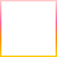
Linear gradient applied to a shape outline
Gradients can also be applied to strokes around shapes. In my next example, I’ll apply the stroke to my rectangle.
View demo
The markup
The gradient is created in the same way as the previous example, but instead on instructing the shape to be filled with it, I instruct the stroke to be filled with it instead by using the context of strokeStyle and applying the variable of linearGradient to it.
Javascript portion
function draw() {
	// Linear gradient on outline
	var canvas = document.getElementById("gradientLinearOutline");
	if (canvas.getContext){
        	var ctx = canvas.getContext("2d");

		linearGradient = ctx.createLinearGradient(200, 0, 200, 200);
		linearGradient.addColorStop(0, "#fcc");
		linearGradient.addColorStop(0.4, "#f69");
		linearGradient.addColorStop(0.75, "#f90");
		linearGradient.addColorStop(1, "#fc3");

		ctx.strokeStyle = linearGradient;
		ctx.lineWidth = 10;

		ctx.strokeRect (0, 0, 200, 200);
		}
}
HTML portion
<body onLoad="draw();">
	<canvas id="gradientLinearOutline" width="200" height="200"></canvas>
</body>
Radial gradients
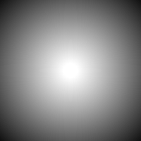
A radial gradient is where a colour is gradually faded into another colour from a central to an outer point. Radial gradients are especially useful for creating effects on spherical 2D shapes, to give them the appearance of having depth.
Two colour radial gradient
In this example, I have created a two-colour radial gradient using black and white and applied it to the rectangle shape.
View demo
The markup
To create a radial gradient, we create a variable called radialGradient, which calls the context createRadialGradient together with a longer string of parameters than what we used for the linear gradients. These mean as follows:
- Gradient start X position
- Gradient start Y position
- Gradient start radius
- Gradient end X position
- Gradient end Y position
- Gradient end radius
In my example, the start and end positions are the same so the gradient radiates around one point, and the end radius is 140 pixels bigger than the start radius. Together, all these values create a radial gradient which radiates out from the central point from white to black (as the X/Y values have been set to the centre of the Canvas).
Javascript portion
function draw() {
	// Radial gradient in square shape
	var canvas = document.getElementById("gradientRadialSquare");
	if (canvas.getContext){
        	var ctx = canvas.getContext("2d");

		radialGradient = ctx.createRadialGradient(100, 100, 10, 100, 100, 150);
		radialGradient.addColorStop(0, "#fff");
		radialGradient.addColorStop(1, "#000");

		ctx.fillStyle = radialGradient;

		ctx.fillRect (0, 0, 200, 200);
	}
}
HTML portion
<body onLoad="draw();">
	<canvas id="gradientRadialSquare" width="200" height="200"></canvas>
</body>
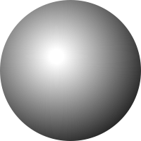
Two colour radial gradient within circle shape
This example is very similar to the gradient above; the only difference is that it has been applied to a circle shape instead of a rectangle, and the position of the start and end points has been changed slightly to make it look like the shine on a sphere.
View demo
The markup
Javascript portion
function draw() {
	// Radial gradient in circle shape
	var canvas = document.getElementById("gradientRadialCircle");
	if (canvas.getContext){
        	var ctx = canvas.getContext("2d");

		var x = 100;
		var y = 100;
		var radius = 100;
		var startAngle = 0;
		var endAngle = Math.PI*2;
		var antiClockwise = false;

		radialGradient = ctx.createRadialGradient(80, 80, 10, 80, 80, 150);
		radialGradient.addColorStop(0, "#fff");
		radialGradient.addColorStop(1, "#000");

		ctx.fillStyle = radialGradient;

		ctx.beginPath();
		ctx.arc(x, y, radius, startAngle, endAngle);
		ctx.closePath();

		ctx.fill();
	}
}
HTML portion
<body onLoad="draw();">
	<canvas id="gradientRadialCircle" width="200" height="200"></canvas>
</body>
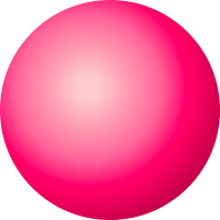
Four colour radial gradient within circle shape
This last example is exactly the same as the one above; the only difference is that more colour stops have been added in various shades of pink to give the appearance of a pink sphere.
View demo
The markup
Javascript portion
function draw() {
	// Coloured radial gradient in circle shape
	var canvas = document.getElementById("gradientRadialCircleColoured");
	if (canvas.getContext){
        	var ctx = canvas.getContext("2d");

		var x = 100;
		var y = 100;
		var radius = 100;
		var startAngle = 0;
		var endAngle = Math.PI*2;
		var antiClockwise = false;

		radialGradient = ctx.createRadialGradient(80, 80, 10, 80, 80, 150);
		radialGradient.addColorStop(0, "#fcc");
		radialGradient.addColorStop(0.4, "#f69");
		radialGradient.addColorStop(0.6, "#f06");
		radialGradient.addColorStop(1, "#903");

		ctx.fillStyle = radialGradient;

		ctx.beginPath();
		ctx.arc(x, y, radius, startAngle, endAngle);
		ctx.closePath();

		ctx.fill();
	}
}
HTML portion
<body onLoad="draw();">
	<canvas id="gradientRadialCircleColoured" width="200" height="200"></canvas>
</body>